

How Custom Hot Stamping Foil Companies Elevate Brand Packaging
2026-06-16
Package design is a silent ambassador, and in crowded retail spaces, every detail counts. Custom hot stamping foil transforms ordinary boxes into memorable brand experiences, adding luxury, texture, and a hint of intrigue. Advanced GUMPTION solutions now make this premium effect more accessible and customizable than ever, helping businesses of every size turn first glances into lasting impressions. Here's how top foil companies are redefining what your packaging can do.
Turning Ordinary Boxes into Tactile Statements
A plain cardboard box rarely stops anyone in their tracks. But when texture enters the equation, the story changes. The moment fingertips graze a surface that’s unexpectedly soft, ribbed, or embossed, curiosity replaces indifference. That split-second interaction reshapes the entire experience—suddenly the box isn’t just a container; it’s a conversation piece. Subtle shifts in material, from a velvety matte finish to a crisp linen pattern, can trigger emotional responses that glossy print alone never achieves. These details lodge in memory, making the unboxing feel less like routine and more like discovery.
Bringing tactility into packaging doesn’t require loud graphics or over-the-top constructions. It’s about intentional contrast: pairing a smooth body with a roughly textured lid, or using blind debossing so designs whisper rather than shout. The physical act of holding the box then becomes part of the brand’s narrative. People may forget what they saw, but they rarely forget how something felt in their hands. That sensory imprint is what turns a simple shipping vessel into an object worth keeping.
Why Hot Stamping Is the Secret to Unboxing Theater
The moment your fingers trace the raised, metallic lettering on a package, the experience shifts from ordinary to cinematic. Hot stamping creates a tactile prelude that builds anticipation before the box is even opened, turning a simple product reveal into an event. That subtle texture under your thumb signals care and quality, making the unboxing feel like unwrapping a story rather than just retrieving an item.
Light catches the foil in unpredictable ways, animating the surface and drawing the eye to details that demand a pause. Unlike flat printing, hot stamped accents introduce depth and reflection, transforming a static box into a dynamic set piece. It’s this interplay of light and touch that elevates the ritual, giving each movement—the slide of a sleeve, the lift of a lid—a sense of ceremony that digital shopping often lacks.
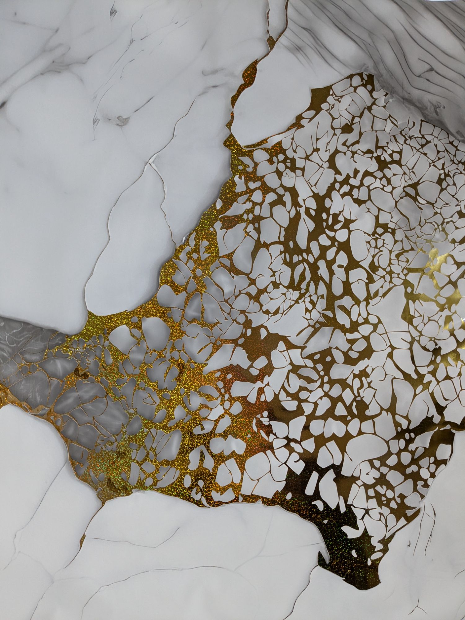
The Alchemy of Light and Foil in Brand Storytelling
Just as alchemists once sought to transform base metals into gold, brand storytellers today wield light and foil to transmute ordinary narratives into luminous experiences. Light acts as the unseen narrator—its angle, intensity, and warmth shaping how audiences perceive a brand's essence. Foil, with its reflective and shape-shifting qualities, becomes the tangible metaphor for a brand’s adaptability and promise of transformation. Together, they create a visual alchemy that bypasses rational thought and touches something instinctive, making the brand not just seen, but felt.
This interplay of brilliance and texture invites viewers into a deeper, almost sacred engagement with the story. Consider how a soft gleam on a product’s edge can evoke craftsmanship and care, or how holographic foil can suggest multiple layers of meaning. The magic lies in the tension between what is illuminated and what is left in shadow—brands that master this technique don’t simply communicate; they radiate. Each flicker of light and every whisper of foil becomes a cue that memory can latch onto, creating an emotional anchor that persists long after the initial encounter.
In practice, this alchemy demands a deliberate choreography of materials and moments. It’s not about overwhelming the senses but about guiding attention with subtlety—using light to reveal core values and foil to hint at untold possibilities. When these elements converge in storytelling, the brand ceases to be a mere entity and becomes a living narrative, one that audiences instinctively want to share. This ancient-modern fusion turns the mundane into the mystical, proving that the most powerful stories are not just told—they are alchemized.
Bespoke Metallics: Matching Foil to Brand DNA
Every brand carries an unspoken rhythm—a set of values, memories, and aspirations that define its voice. Metallic foils are not just decorative accents; they are a tactile extension of that identity. A deep charcoal bronze might whisper old-world craftsmanship for a heritage leather goods brand, while a holographic lavender foil could echo the playful unpredictability of a youth-focused beauty line. The alchemy lies in tuning the foil’s reflectivity, texture, and hue to the subtle frequencies of the brand’s DNA, transforming packaging into a silent ambassador.
The selection process moves beyond aesthetic preference into a dialogue between material and meaning. A matte champagne gold, soft and diffident, can convey understated luxury without a hint of ostentation, perfectly aligning with a minimalist jewelry brand. Conversely, a high-gloss crimson foil with a crackled finish might capture the raw, untamed energy of an edgy streetwear label. Each finish—from brushed to mirror, from pigment-dusted to transparent—adds a layer of storytelling, ensuring the metallic doesn’t just sit on the surface but weaves itself into the brand’s narrative.
True brand alignment often requires custom foil development, where the precise temperature, pressure, and dwell time are calibrated to the chosen substrate. This bespoke approach allows for unique color matching—perhaps a foil that shifts from sea green to copper under different lighting, mirroring the fluid identity of a contemporary art gallery. By deeply integrating foil choice with brand essence, designers create a multisensory encounter that stays in the mind long after the unboxing, making the intangible spirit of the brand visible, touchable, and unforgettable.
From Subtle Texture to Bold Shine: Crafting Shelf Impact
A whisper can be just as arresting as a shout, especially when it comes to packaging. Think of a label with a barely-there grain, a carton that feels like soft stone, or an embossed pattern you don’t see until you’re holding the product. These subtle textures reward proximity. They turn a casual glance into a tactile investigation, making the shelf a place of discovery rather than just display.
At the other extreme, nothing competes with unapologetic gloss. Mirror-like lacquers, foil-stamped details, and light-catching laminates demand attention from across the aisle. They signal modernity, luxury, or pure energy—the kind of packaging that seems to vibrate under store lights. Used with restraint, bold shine can elevate a simple shape into something unmistakable, creating a visual anchor in a sea of matte competitors.
The real magic happens when both worlds collide. A design that pairs a velvety background with razor-sharp metallic accents doesn’t just sit on the shelf—it moves. It invites touch while rewarding the eye, guiding the shopper’s hand with contrast and curiosity. This duality isn’t about following trends; it’s about understanding how surfaces behave in real retail environments and using that to build a presence that feels intentional, not engineered.
Future-Ready Foiling: Eco-Conscious and Tech-Infused
The next wave of foiling isn’t just about performance on the water — it’s about rethinking materials and manufacturing to reduce environmental impact without sacrificing stiffness or speed. Bio-based epoxy resins, recycled carbon cores, and natural fiber laminates are quietly replacing petroleum-heavy layups. Some builders are even experimenting with thermoplastic composites that can be remolded and recycled at end of life, cutting down on the landfill legacy of high-performance gear. It’s a shift driven as much by accessible material science as by demand from conscientious riders who want their quiver to reflect values, not just velocity.
Tech infusion runs deeper than materials. Sensor packages embedded directly into foils and boards are turning every session into a data stream — real-time feedback on angle of attack, flex, and vibration helps riders refine technique while giving designers insights that used to require expensive prototyping tanks. Machine-learning algorithms digest this data to predict cavitation onset or suggest subtle shape tweaks for better glide at lower speeds. The beauty is that all this happens in the background, no screens required on the water; you simply ride, and the foil learns.
Looking forward, the fusion of eco-smart build methods with adaptive digital feedback means foiling equipment that evolves over time. Instead of replacing an entire setup when styles or conditions change, riders might swap modular, disassemblable components made from regionally sourced bio-materials. Firmware updates could alter a wing’s hydroelastic behavior within safe limits. The result is a kit that stays relevant season after season, lowering the consumption churn that has long defined watersports — without ever diluting the raw sensation that makes foiling so addictive.
FAQ
Custom foils are engineered to match exact brand colors, textures, and effects—think holographics, matte finishes, or even multi-dimensional patterns. Standard foils limit you to generic golds and silvers, but custom work lets you embed unique visual signatures that standard suppliers simply can't replicate.
It's mostly psychological. When you see a package with precision metallic accents, your brain immediately registers it as premium. Custom hot stamping adds that tactile and reflective quality that makes unboxing feel like an event, subtly convincing customers that what's inside is worth the higher price.
Many studios now cater to small-batch runs and startups. They use modular tooling and digital processes that drastically reduce setup costs. So yes, a niche skincare label or craft distillery can absolutely afford this, often for the price of a high-end dinner, if they plan wisely.
Overdoing it is the biggest one. Too much foil creates noise, not elegance. Another common error is ignoring substrate compatibility—some papers absorb too much heat, leading to blurred edges. The best results come from restraint and close collaboration with the foil supplier on material testing.
It creates a sensory signature. Imagine a wine label with a subtle, embossed crest that catches light differently from every angle. That physical memory sticks. Customers begin to associate that specific tactile shimmer with your brand, even before they read a logo. That's hard to copy with digital printing alone.
Absolutely. Some companies now offer recyclable polyester foils and water-based adhesive systems. Others invest in waste-recovery programs where unused foil is reintegrated into new rolls. You can even find studios that use bio-based pigments. So it's possible to achieve that premium look without the green guilt.
Their problem-solving instinct. Beyond the aesthetic, they troubleshoot production issues like adhesion on curved surfaces or alignment on irregular shapes. They often suggest tweaks—like adjusting stamping pressure or die temperature—that save hours of trial and error on the factory floor.
It varies, but for a moderate order, expect about three to four weeks. This includes design consultation, foil color matching, die manufacturing, and a small test run. Rush services can compress that, but you risk sacrificing quality control. Smart brands build this lead time into their product launch calendar.
Conclusion
Custom hot stamping foil specialists are redefining what packaging can communicate. They take everyday boxes and turn them into something you instinctively want to touch—a matte black carton suddenly catches light with a hint of copper, or a minimalist white box feels warmer thanks to a barely-there metallic grain. That shift from graphic to texture is what makes unboxing memorable. It’s not just about adding shine; it’s about choreographing a moment where light plays across a surface, drawing the eye in stages. A subtle embossed logo reveals itself as you tilt the package, then a bold foil flourish commands attention when you open it. This interplay of light and material gives brands a voice that goes beyond print, turning a simple container into a tactile prelude to the product inside.
The real artistry lies in matching the foil to the brand’s character. Companies work closely with designers to develop custom metallic shades—maybe a weathered brass for a heritage label, or a hyper-reflective chrome for a tech startup. The finish itself tells a story: a soft satin texture whispers understated luxury, while a high-gloss gold shouts confidence on a crowded shelf. Brands are also responding to a growing demand for responsible materials; many foils now use recycled content and thin-film technology to reduce waste without sacrificing presence. Some even incorporate codes that connect to digital content, making the package itself a bridge to an extended narrative. It’s this blend of physical allure and smart thinking that keeps packaging ahead of expectations, proving that a box is never just a box when foil is in the mix.
Contact Us
Contact Person: Hsien
Email: [email protected]
Tel/WhatsApp: +86 57387072688
Website: https://www.gsfilm.cn