Top 10 Kraft Paper Box Styles for Elegant Product Packaging
2026-10-09
Kraft paper boxes have quietly become the understated heroes of premium packaging—sturdy enough to protect, yet textured and warm enough to feel intentional. In this guide, we’re counting down ten styles that elevate products from simply boxed to beautifully presented. Whether you’re drawn to minimal tuck-end designs or bold rigid setups, Kuaijie Carton proves that sustainable materials don’t have to sacrifice elegance. Here’s what to look for when choosing the right kraft box for your brand.
The Rigid Kraft Box That Refuses to Be Thrown Away
Most boxes end up in the recycling bin within a week of arrival, flattened and forgotten. This one sticks around. The rigid kraft construction feels substantial in a way thin folding cartons never do—it doesn't flex when you pick it up, and the natural brown fiber has a quiet, utilitarian dignity that makes you want to keep it on a shelf rather than shove it under the bed.
Maybe it's the way the lid slides off with just enough resistance, or how the raw edges stay crisp instead of fraying. People find new jobs for it: storing sewing supplies, corralling charging cables, holding a half-read paperback. It becomes a permanent resident of a desk drawer or a bookshelf, earning its place long after whatever came inside has been used up.
The kraft board ages well too. Scuffs and fingerprints just add to the character instead of making it look shabby. It never quite looks like trash, so it never quite gets treated like trash.
Magnetic Kraft Closures: A Soft Click That Signals Quality
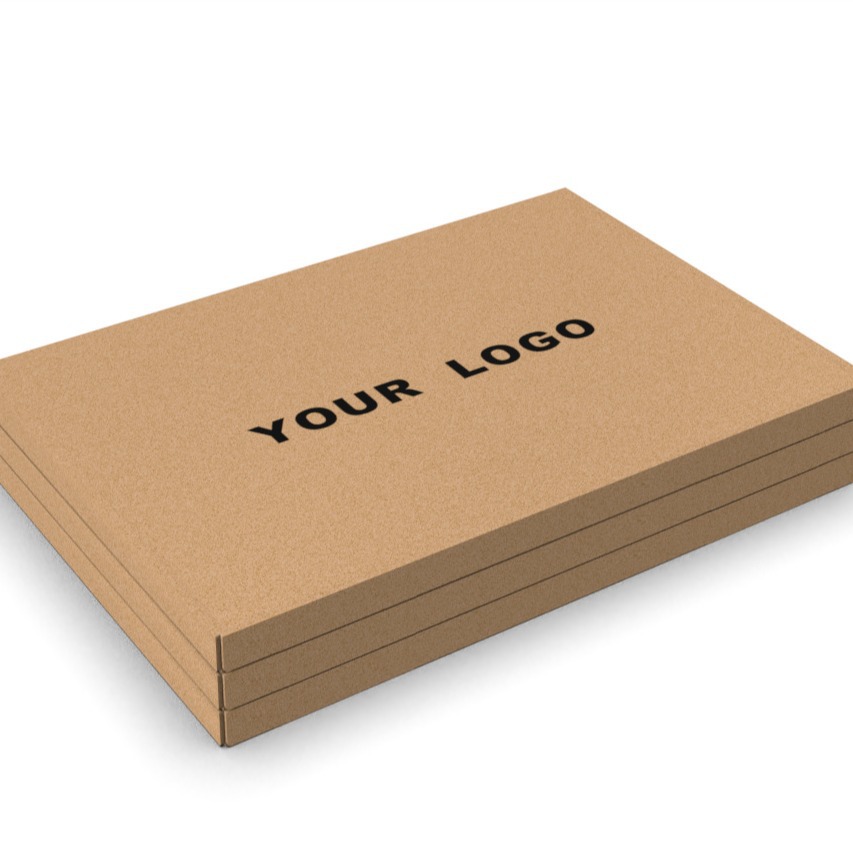
A good magnetic kraft closure doesn't announce itself. It lands like a felted cue ball against a bumper: low, quick, and certain. Two thin magnets seated between layers of kraft paper pull into alignment just before the flap is fully down, so the closing action feels guided rather than forced. The sound is not a plastic snap or a metallic clack, but a soft click that arrives after the paper has already settled. That subtle spacing, often less than a millimeter, is what separates a premium closure from a cheap one.
This soft click also communicates precision without a word of explanation. If the magnets are slightly off axis or too weak for the paper weight, the flap drifts or needs pressing. When they are matched correctly, the closure holds with a quiet authority that invites the user to open and close it again. Over time, the kraft hinge softens but the magnets keep their alignment, so the package ages into something worth keeping on a desk or shelf. It is a small detail, but one that consistently signals attention to material behavior, not just visual design.
Drawer-Style Kraft Boxes for a Slower, More Deliberate Reveal
Drawer-style kraft boxes shift the unboxing rhythm. Instead of lifting a lid and seeing everything at once, you slide the inner tray open, and the item emerges gradually. That small pause turns a routine action into a small moment of anticipation.
The kraft texture adds to the effect. It's uncoated, slightly rough under the fingers, and it doesn't try to look glossy or loud. The muted brown sets a calm tone, so the object inside—whether a candle, a notebook, or a piece of jewelry—becomes the focus. Sliding the drawer feels a little like opening a keepsake box rather than tearing into standard packaging.
This style works well for brands that want to encourage a slower, more mindful interaction. There's no need for excessive tape or filler; the sliding mechanism is secure enough on its own. And because the box can be reused, the reveal doesn't end after the first opening—it continues each time the drawer is pulled.
Windowed Kraft Packaging: When a Peek Builds Desire
Kraft paper carries a quiet, almost rustic honesty, but cut a small window into it and the package starts to speak differently. That little opening doesn't reveal everything—just enough: the curve of a soap bar, the grain of loose-leaf tea, the color of a candle. The contrast between matte brown fibers and whatever sits inside creates a visual pause. You look longer, not because the product is shouting, but because it's partially hidden.
A full transparent box often cheapens the reveal. A window, though, frames the product like a small stage. The eye fills in what's missing, and that act of completion builds a quiet sense of ownership before the box is even opened. It's the same reason a curtain drawn halfway across a window feels more inviting than a bare pane—curiosity thrives on restraint.
For brands, this format does something subtle but powerful. It lets the material stay humble while the product becomes the accent. You don't need bright graphics or bold claims; the cutout does the storytelling. And because kraft paper already feels tactile and grounded, the window turns a simple container into an object that asks to be picked up, turned over, and imagined in daily life.
The Flat-Packed Kraft Carton That Unfolds Into Quiet Luxury
At first, it arrives as a slim, unassuming sheet of kraft board, scored with precision and folded flat enough to slip through a letterbox. There is no glossy coating, no embossed logo shouting for attention—just the raw, fibrous warmth of recycled paper resting quietly in your hands. The creases are sharp, the edges clean, and the act of unfolding feels less like opening a package and more like engaging with a piece of considered design. Each fold releases a faint crackle, as if the material itself is waking from its compressed journey.
As the carton takes shape, the muted brown surface catches light in a way that feels almost deliberate. The interior reveals a soft, unbleached lining that contrasts subtly with the outer shell, no bright whites or sterile finishes. It is a study in restraint: the texture invites touch, the structure holds its form without effort, and the absence of decoration allows the raw materiality to become the focal point. There is a quiet confidence here, a sense that luxury need not shout but can instead be found in the honesty of a well-made, durable container.
What makes this carton linger in the mind is how it reframes the packaging moment. It does not disappear into a landfill of forgotten boxes; instead, it demands a pause. The simple geometry, the subtle give of the kraft fibers under fingertip pressure, the way it sits on a table like a sculptural object rather than a discardable shell—all of it points to a larger idea: that true quiet luxury is not about excess, but about intention. And in the end, when the carton is emptied, it remains beautiful enough to keep, to repurpose, or to unfold flat once more and tuck away, ready for the next unfolding.
Kraft Inserts That Turn a Simple Box Into a Curated Experience
A kraft insert does more than cushion a product—it frames it. Instead of letting an item rattle around in a sea of brown filler, a precisely cut tray or sleeve gives every component its own place. The matte, unbleached surface absorbs light softly, making the contents feel intentional, almost like objects on a gallery shelf. Even a single tea tin or a pair of ceramic cups suddenly reads as a considered set, not just a shipment.
The magic is in the restraint. Kraft paper’s natural tone doesn’t compete with your product’s colors or branding; it steps back, offering texture rather than noise. A die-cut window here, a folded corner there—these small gestures guide the eye from the first touch to the moment of unwrapping. The insert becomes a quiet narrative: this thing was expected, placed, and prepared for you.
And because kraft is endlessly workable, the inserts can be tailored to odd shapes, multi-part kits, or even a layered reveal. Slide out a top tray to find a hidden compartment beneath. Tuck a handwritten note into a slit that holds it upright. The box stops being mere packaging and starts behaving like a tiny stage, with the insert as its set designer.
FAQ
Rigid two-piece boxes with a kraft wrap work beautifully for candles because they give a clean, sturdy base for a branded label. For a softer look, pillow boxes with a die-cut window let the candle color peek through, while drawer-style boxes with a foam insert keep glass jars from shifting during shipping.
Skip the glossy coatings and lean into contrast: a blind debossed logo on raw kraft looks more considered than a printed one. Add a thin ribbon pull tab or a colored inner liner—deep teal or terracotta against kraft feels instantly curated. A simple belly band with letterpress text can also do a lot of the heavy lifting.
Mailer boxes with interlocking flaps are the go-to because they eliminate the need for tape and hold up well to rough handling. Choose a double-wall kraft corrugated if your products are heavy, and add scored inserts or a custom tray so items don't rattle around. The natural kraft exterior also hides scuffs better than white.
White ink screen printing is a favorite because it pops against the brown background and still lets the fiber show through. Foil stamping in gold or copper reads as warm and premium, while blind embossing creates a subtle, tactile logo. Avoid full-coverage dark ink—it can look muddy; leave at least 30 percent of the surface unprinted to let the material breathe.
Yes, but only if you choose the right board. Standard folding carton kraft is too flimsy for glass; instead use corrugated kraft with a B- or E-flute, or a rigid chipboard box wrapped in kraft paper. For bottles, a two-piece box with a die-cut cradle or dividers prevents impact damage far better than a tuck-top.
Kraft pulp is typically unbleached, so it uses fewer chemicals and retains more of the original wood fiber. Boxes made from recycled kraft can be recycled again curbside, and if you avoid plastic lamination and use water-based inks, the whole package can break down in home compost. That closed-loop story is hard to match with coated white boards.
Use small, strategic hits of color rather than flooding the surface. A single solid-color belly band, a stamped edge in a bright hue, or a die-cut shape backed with colored paper creates energy while most of the kraft remains exposed. Water-based flexo inks in one or two spot colors are ideal for this approach.
Hexagonal boxes and slim sleeve-and-tray designs break the standard rectangle shape and invite touch. A two-piece telescoping box with a thumb notch feels like a keepsake, while a pillow box with a nested insert can hold oddly shaped items like soap bars or rolled textiles. The trick is to keep the structure simple enough to assemble quickly but distinctive enough to stop someone mid-scroll.
Conclusion
Kraft paper rarely shouts, but when it is folded into a rigid box with clean edges and a soft-touch laminate, it does something better: it stays. Customers hold onto that kind of box, tucking it on a shelf or reusing it for small keepsakes, and that quiet retention is a stronger endorsement than any printed claim. Add a magnetic closure and the experience shifts again. The lid meets the base with a low, cushioned click—not the hollow snap of a cheap clasp—and suddenly the package feels expensive before the product even appears. Drawer-style kraft boxes push that feeling further. There is no lid to lift, just a tray that slides out with a little resistance, slowing the reveal and giving the hands a moment to catch up with the eyes.
But elegance in kraft packaging does not always mean hiding the contents. A small die-cut window in the front panel can act like a teaser, letting a sliver of color or texture show through and inviting a closer look before the box is even opened. For brands that want to balance refinement with shipping efficiency, flat-packed kraft cartons deliver both. They arrive in a slim bundle, fold into shape without tape or tools, and still hold their form under the weight of a jar or candle. Then, once the outer shell is open, the inside has to do its part. Custom kraft inserts—whether a molded paper tray, a divided grid, or a simple folded cradle—lift a plain box into something closer to a curated display, keeping every component in place so the unboxing feels less like unwrapping and more like being handed something carefully chosen.
Contact Us
Contact Person: Tan Xiang
Email: [email protected]
Tel/WhatsApp: 8613798906863
Website: https://www.dgkjzx.com